Of most importance for me, regardless of what is on the palette, is that the color mood of the painting is not the result of what specific colors are put out, but of what the painter can do with those colors to create a color complexion in the painting. I use the same colors for night painting, day painting, painting in Italy, painting on the coast of Ireland, urban painting, or rural painting — the idea being that the colors are like the tools in a stone mason’s bag and it is the mason’s job to use the tools to get the job done.
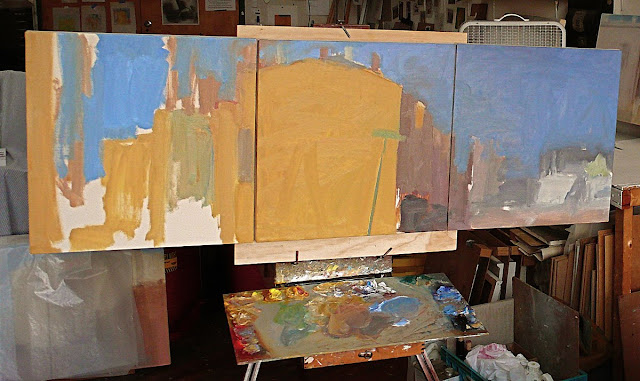
Just because a landscape is green doesn’t mean we don’t have reds on the palette. Everything gets mixed with everything, the color is never even close to being right out of the tube, and the palette has to look like a battlefield, which it is. The warms and the cools, mixing it up in the middle, out of which comes color. But until the color is put down on the canvas there is still really no color. Color is something that cannot exist on the palette but only in juxtaposition in the painting itself.
- So now my palette looks like this:
- Earth red (maybe Pozzuoli, Venetian, or English red light)
- Quinacridone Red
- Winsor Red
- Permanent Red Medium
- Cad Red Light
- often, Raw Sienna
- Yellow Ochre
- Yellow Ochre Light
- Indian Yellow (W&N)
- Permanent Yellow Deep
- Permanent Yellow Medium
- Perm Yellow Light
- Hansa Yellow or Winsor Yellow
- Viridian
- Ultramarine Deep
- Cobalt Blue
- Cerulean Blue
- Ivory Black
My white has evolved slowly over many years. All through school I made a 50/50 mixture of Flake or Cremnintz and Permalba (it’s a titanium/zinc mixture). That slowly evolved into what I now use: some flake, some remnants (one is warm and one is cool and they have different densities and opacities), Permalba White, and Flake White Replacement (Gamblin). Don’t ask why, it is something that evolved by intuitive touch over 25 years, but easily more than half is Permalba and FWR. Often I think it’s time to stop using lead, and I never recommend this to students, we are surrounded by enough toxicity. So a very good white is FWR (Gamblin) and Permalba, 50/50. Click here to read about Ruth Miller’s Atmosphere of Thought.
I don’t care about brand, but finances dictate: always relatively inexpensive but not junk: Winsor &Newton, Rembrandt and Gamblin (when on sale). I cannot afford Old Holland or Williamsburg.
I use a medium made up of cold pressed linseed oil, stand oil and turp. But I never, ever put out a medium cup – the stuff gets mixed in with the big pile of white and that’s all there is. I don’t like a shiny surface and tend to work opaquely with no transparencies.
I have never used raw umber or burnt umber or any brown. We can mix many more beautiful browns on the palette while at work, more chromatic browns, than anything out of a tube. I detest the idea of brown on the palette. But that is probably because I came out of a “secrets of the old masters” camp as a student and this is the reaction.
More to read: Special Birthday Gift Ideas and Why Hampers Make the Best Presents